Doctrine takes a sermon to arrive. Text doesn’t wait that long.
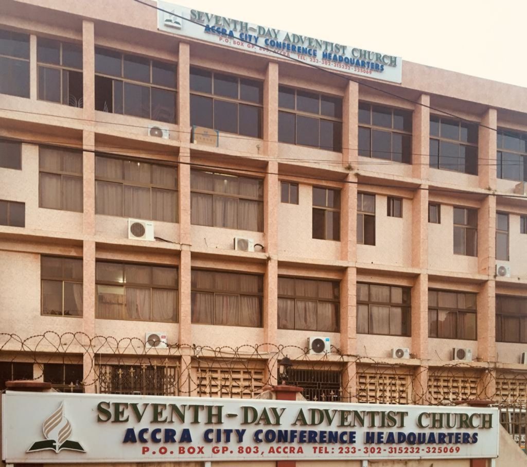
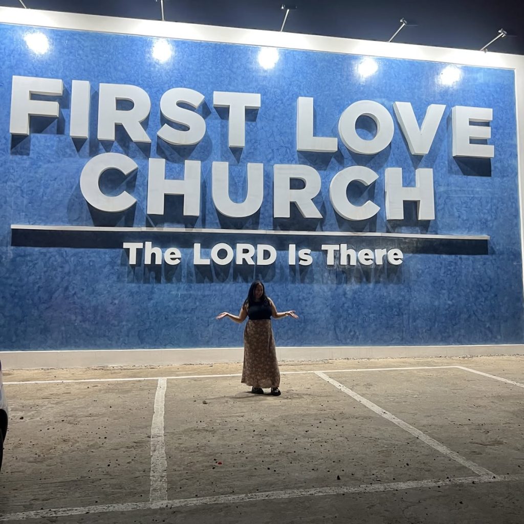
Before anyone sings, before a single sermon is preached, the letters on the outside of the building have already made their case. The Seventh-day Adventist headquarters on the way into Accra announces its own name twice: once across the top floor in navy capitals large enough to survive the noise of traffic, and again at street level in green, as though the first announcement knew it needed repetition to imprint belief. In an empty parking lot at night, a woman poses with her arms open beneath letters the size of a room, white block capitals raised in relief against saturated blue: FIRST LOVE CHURCH. THE LORD IS THERE. Lit from above and casting their own shadows, the letters become part of the building itself. The sermon hasn’t started. The typography is already working.
But not every building begins from the same place. St. James Catholic Church doesn’t need its name to be recognised. The cross rises out of the roofline itself. Saint icons are worked directly into the façade in stone and colour, gold halos catching light the way the letters at First Love catch it artificially. A stranger driving past would know what this building is before reading a single word. The same is true, more modestly, of the Adventist church in Bekwai, its pitched roof and small cross silhouette announcing church on sight long before the signboard names the conference or the district.
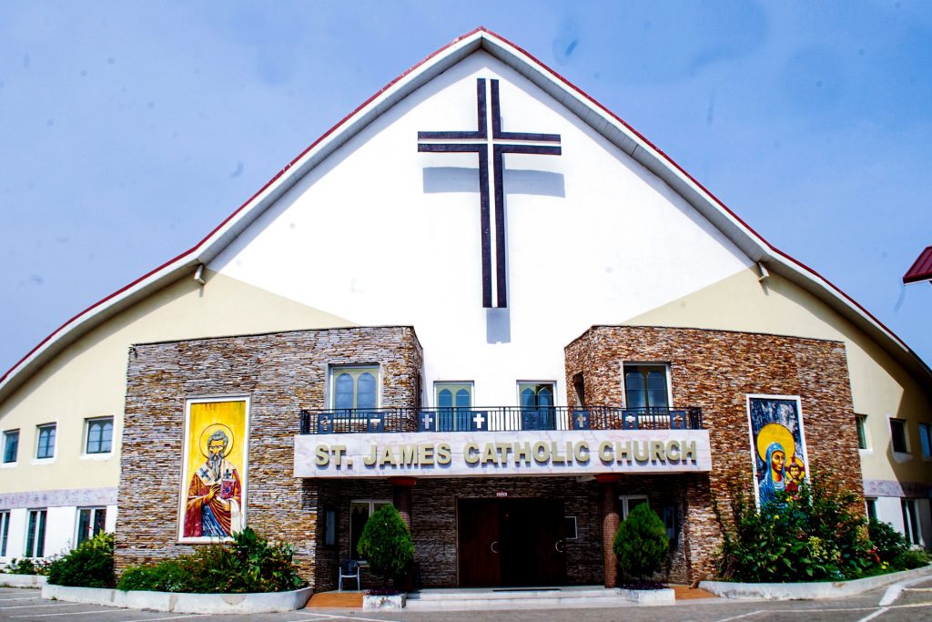
Here, architecture has already introduced the building. The lettering simply reinforces what the stone, cross and roofline have already said.
Presbyterian, Methodist, SDA, Catholic—all four inherit a vocabulary passed down through the buildings themselves: the pitch, the stone, the cross, the arch. Their lettering is rarely introducing the building. It’s reinforcing something the structure has already said, which is why it can afford to stay small, serif or plain sans, black or navy on white, unhurried.
First Love Church has no such inheritance. Neither do most of the newer charismatic churches occupying converted warehouses, rented halls or walls in parking lots. Nothing about the structure says church: no cross rising from a roofline, no stained glass, no stone. Converted warehouses don’t inherit centuries of ecclesiastical architecture. A rented hall doesn’t arrive with a bell tower.
The typography has to invent recognition from scratch.
Suddenly the oversized capitals, the gold foil, the drop shadows and illuminated lettering feel less like decoration and more like compensation.
The text is doing work the building cannot. It’s doing the entire job the architecture would otherwise do: letters built to the size of a room, dimensional rather than flat, gold foil, drop shadows, backlighting—the whole vocabulary of a product launch borrowed to make a building legible from nothing.
This split runs all the way through the names themselves: Presbyterian Church of Ghana, Immanuel Congregation, Madina. Methodist Church Ghana, Accra Diocese, New Aplaku Circuit, Bethel Society.
These aren’t names so much as lineages, spoken in a single breath, telling you not just what the church is but exactly where it sits inside something larger than itself. Nobody here invented their own authority. Above this building is a diocese, and above the diocese is a whole inherited weight the sign is quietly asking to be noticed.
Set that beside International Central Gospel Church or Action Chapel International, and the length is doing something else entirely—reaching outward instead of rooting inward, claiming the world instead of claiming a lineage.
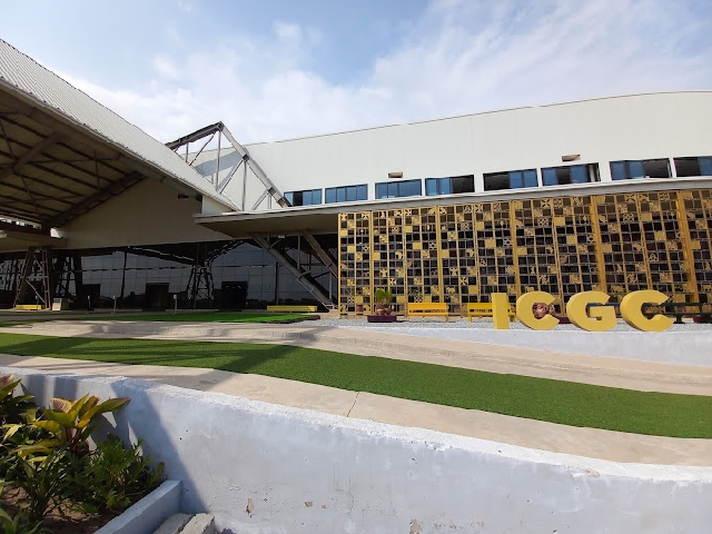
The typography is carrying institutional memory.
Scale follows the same logic outward.
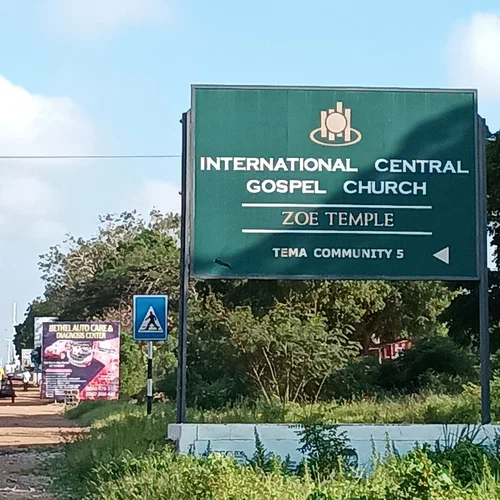
The ICGC road sign pointing traffic toward Zoe Temple in Tema was never built for the people who already know the church exists. It was built for the driver who doesn’t, which is why it reads more like a highway exit marker than a church sign: white on deep green, no ornament, purely functional.
The billboard for Evangel Cathedral works differently. The Archbishop’s face beside the Bishop’s. Service times listed like store hours. A phone number along the bottom. It is built to be read at speed, from a moving trotro, with the same hunger for attention as anything else being sold on that road.
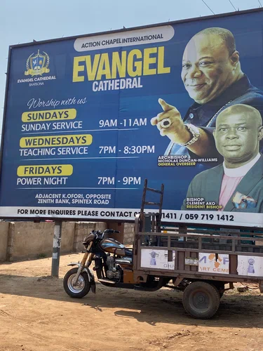
And it has to compete for that attention. A church sign may share its junction with an advertisement for an auto shop. Nobody planned that closeness, but there it will be: one public presence sitting beside another, each trying to hold its ground.
The most surprising text came from the Presbyterians. Expect restraint there, and mostly find it: the crest, the full denominational name, a motto worked so completely into a gate in Osu that it isn’t a sign bolted onto iron—it is the iron.
THAT THEY ALL MAY BE ONE cast into the bars themselves, unwilling to be taken down without the gate coming down with it.
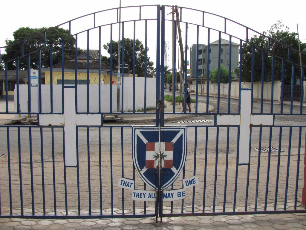
That is permanence made structural.
But a few roads over, the same church has strung up vinyl banners for a national crusade: a countdown clock ticking six days to go, sponsor logos along the bottom, a livestream credit, gold gradient lettering over a stormy sky background—the exact visual grammar of a concert bill.
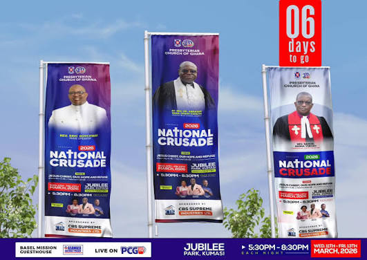
Permanent text claims identity.
Temporary text claims urgency.
The most institutionally careful denomination in this set has still reached, somewhere, for the same urgency as the smallest independent ministry flyer, the kind with a dove mid-flight and an apostle’s face glowing gold above a WhatsApp number.
Different materials produce different kinds of authority. Vinyl borrows the shine and speed of an event poster. Cast iron borrows the permanence of a monument. This church’s typography is fluent in both.
Even the wear tells a story. On a signboard near Osu, an older congregation’s name is still faintly visible beneath a repaint, a name someone tried to cover and didn’t quite manage to erase. What looks permanent turns out to be revisable after all. The gate resists this. The signboard doesn’t. Two different ideas about what church text is allowed to become, standing a short walk from each other.
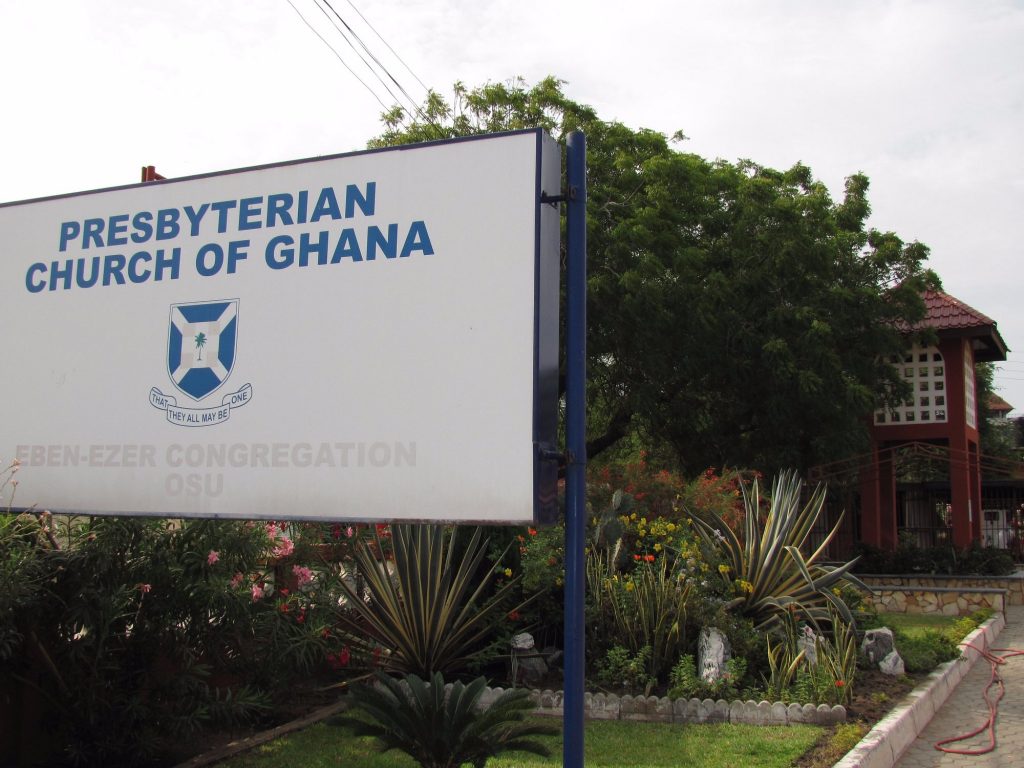
None of this text, in the end, is really speaking to the people already inside.
The scripture boards outside Immanuel Congregation aren’t written for the member who already planned to be there on Sunday. They’re written for whoever happens to be walking past on a Tuesday, someone who wasn’t thinking about God at all until a framed board on private property reached out and insisted that His name is the only one that can save you.
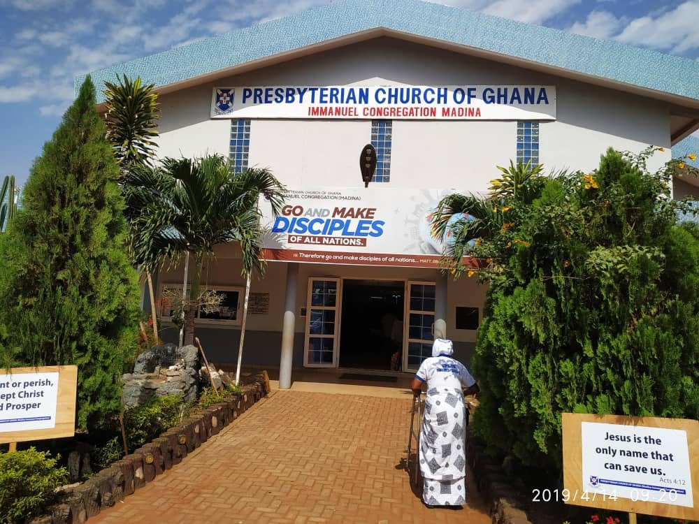
That is the real audience of church text—not the congregation, but the stranger.
Recognition first, where there is no inherited vocabulary of stone or cross to lean on. Reinforcement, where there is.
Long before a sermon asks us what to believe, the building has already used text to tell us what kind of place it wants to be.
This is Textual Claims: typography used to investigate public life. The illustration below is my interpretation of the word CHURCH, using depth and dimension so the text itself becomes the image.