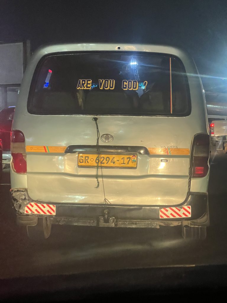
At night, in traffic, a rear windscreen glows blue and asks a question nobody else on the road was invited to answer. ARE YOU GOD? The letters are lit, slightly ornamented, the kind of typography built to be noticed in a dark queue of cars rather than read at leisure. Nobody knows who it’s addressed to. Maybe the driver who just cut in. Maybe every driver or hawker or passerby. That’s the thing about transport text: it moves, so it can’t count on anyone reading it twice, and it can’t count on knowing exactly who’s behind it when it’s written.
Every vehicle on the road already carries the text it’s required to carry. A licence plate, GS 354-19, GN 6037-19. A manufacturer’s badge, Toyota, Hyundai, Chevrolet. Sometimes a fleet marking, a route number, the regulated minimum a vehicle needs to be legal and identifiable. None of that text was chosen by the person driving it. Then, somewhere on the same body, usually the rear windscreen or sometimes the door panel, a second layer of text appears that nobody required and nobody standardised.
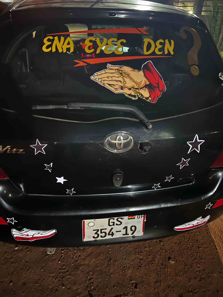
Ɛna ɛyɛɛ dɛn (and then what happened) arched in gold across a Toyota Vitz’s back window, a pair of praying hands stickered beneath it, stars and a pair of sneakers scattered across the boot like the car itself is being dressed rather than labelled. The plate identifies the vehicle. Everything else identifies the person driving it.
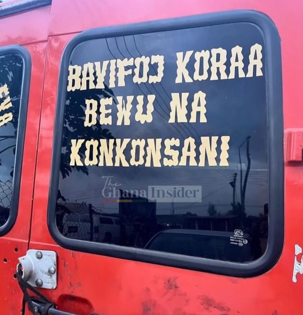
That second layer is doing something the regulated layer structurally cannot. It’s rarely speaking to a passenger who already chose to get in. Atanfo ɛnyɛ Nyame (enemies are not God) sits across the back of a taxi in yellow on black, a line of reassurance that has nothing to do with the destination and everything to do with the driver. Bayifoɔ koraa bewu na kɔnkɔnsani (even a witch will die, how much more a gossip) rendered in a font that looks lifted from an old western wanted poster.
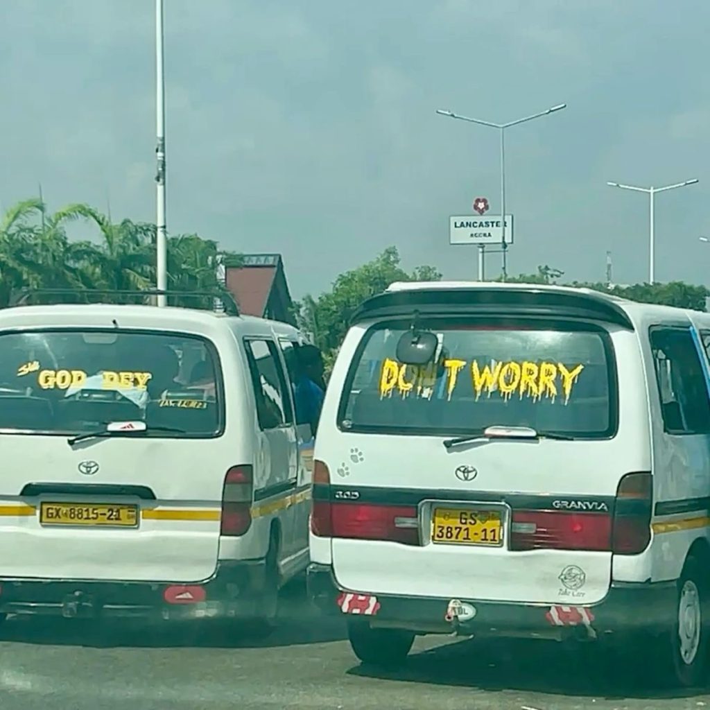
Two vans, parked side by side, make the point almost too neatly. One windscreen reads GOD DEY. The other, doors away, reads DON’T WORRY. Neither driver coordinated with the other. But read together, by accident, from behind, they form a sentence nobody wrote. That’s what movement does to this text that stillness doesn’t. A building sign stays where it is and waits to be read by whoever walks past. Transport text is already gone by the time anyone’s finished reading it, which means its real audience was never really passersby at all. It’s whoever’s stuck behind it in traffic, held there just long enough, and it’s the driver, glancing at his own words in the mirror more often than any stranger ever will.
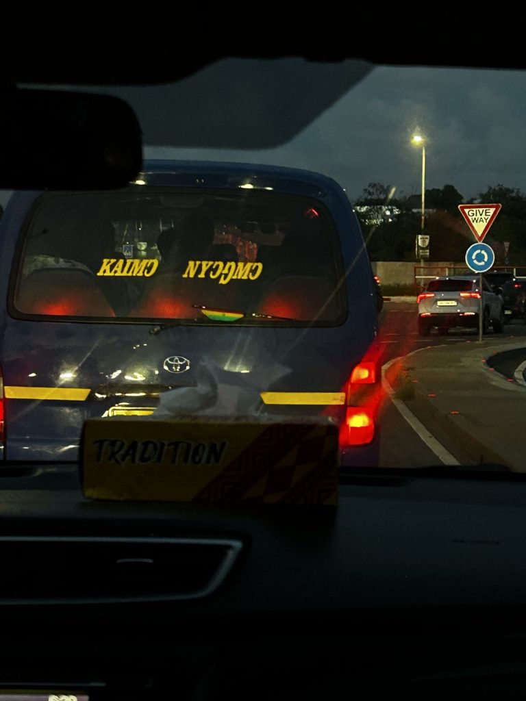
That inward address shows up literally on one van, where the text KAIMƆ NYƆŊMƆ, (remember God), appears mirrored, backward, evidently applied to the inside of the glass rather than the outside. Someone chose to mount it facing in. Read correctly, it’s not a message to the road. It’s a message to whoever’s sitting behind the wheel, meant to be caught sideways in a rearview mirror on some ordinary Tuesday, and not performed for anyone else at all.
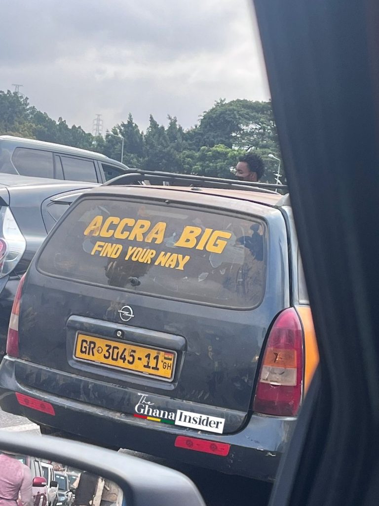
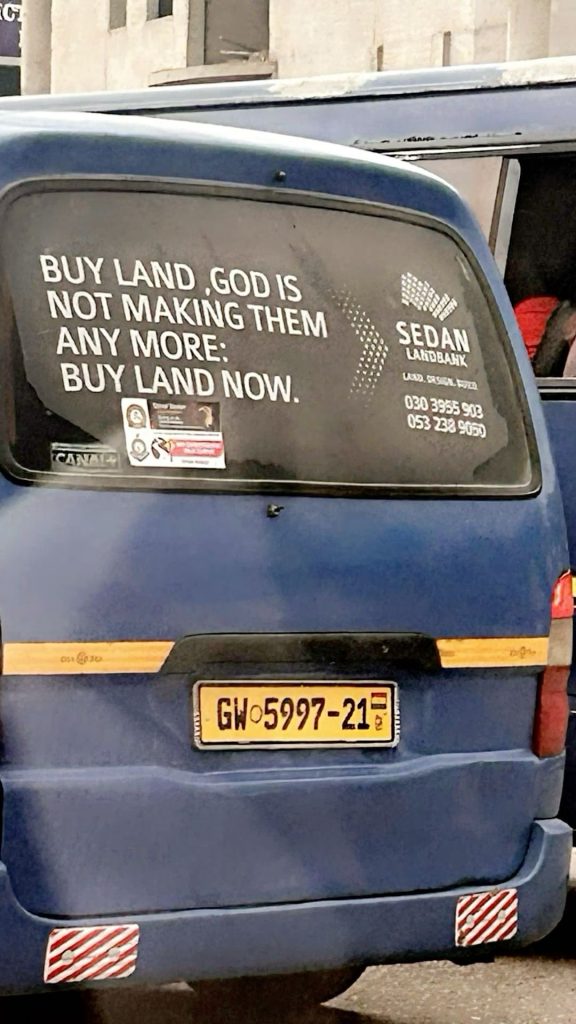
Language does its own quiet sorting here. The proverbs, the ones about witches and gossips and enemies, arrive in Twi, addressed to a listener who’s assumed to already share the moral world the proverb comes from. Pidgin carries the broader, more universal reassurances, GOD DEY, DON’T WORRY, TIME NO DEY, phrases built to be understood by absolutely anyone stuck in the same traffic regardless of what language they grew up praying in. English shows up hardest at the edges, in the confrontational ARE YOU GOD, in the wry ACCRA BIG, FIND YOUR WAY, in the advertising that’s learned to borrow the register of faith wholesale, BUY LAND, GOD IS NOT MAKING THEM ANY MORE, a property company reaching for scripture’s certainty to sell land the same way a driver reaches for it to survive the road.
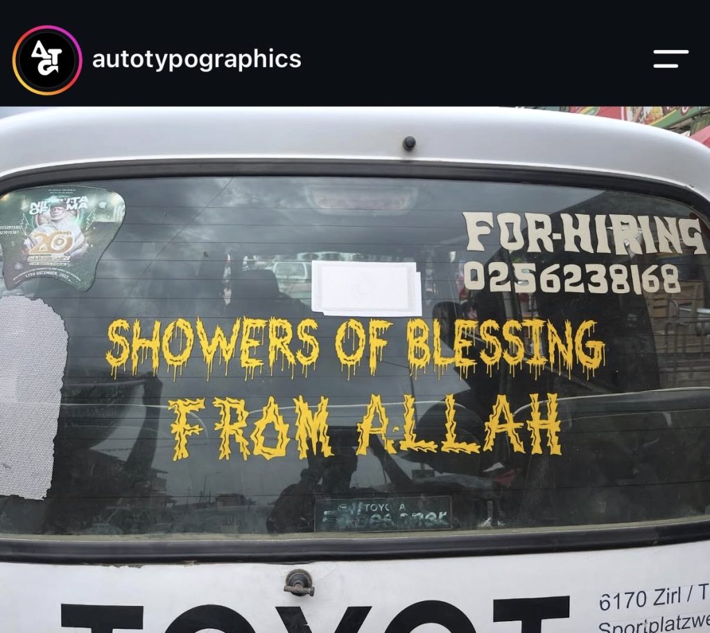
Even the typography clusters into a shared vocabulary that nobody officially designed. That dripping, melting lettering shows up more than once, on DON’T WORRY, on SHOWERS OF BLESSING FROM ALLAH stacked right above a phone number FOR HIRING in a completely different, plainer font in the same window, commerce and blessing occupying the same pane of glass without touching. It’s close to a house style, the kind of stencil work a sign painter offers because it’s what people ask for, less an individual’s typographic choice than a whole trade’s inherited default for what urgency is supposed to look like.
And almost all of it is yellow. White turns up occasionally, on a taxi’s rear banner, on a cursive line here or there, but yellow is the default, the colour built to hold against black glass at fifty metres in moving traffic the way no single font needs to work as hard to do alone. The fonts themselves vary widely, dripping wax, a wanted-poster serif, a glowing outline, gold script, but every one of them is doing the same job: bold, condensed, built to be read in under a second by someone who has no intention of stopping to look. Different sign painters, different budgets, different corners of the city, and somehow the same instinct every time, a typographic language the whole city already reads fluently without anyone having taught it.
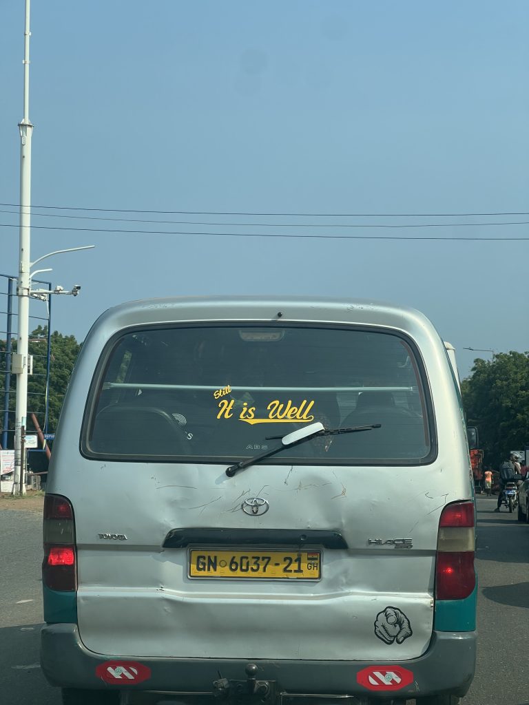
Faith is everywhere in this set because roads and driving in Ghana give people real reasons to need it. STILL IT IS WELL sits across a windscreen in gold cursive. The word carrying the weight isn’t well, it’s still, a word that only makes sense if something already happened worth surviving. The text doesn’t need a wreck behind it to prove itself, it already assumes one, admitting just enough to sound earned without ever naming what.
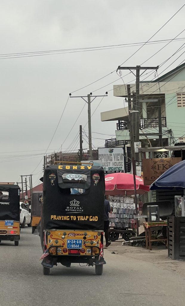
PRAYING TO TRAP GOD, stencilled on a tricycle, addresses God like something to be worked, not worshipped, its own kind of honesty about what desperate, repeated prayer can start to feel like.
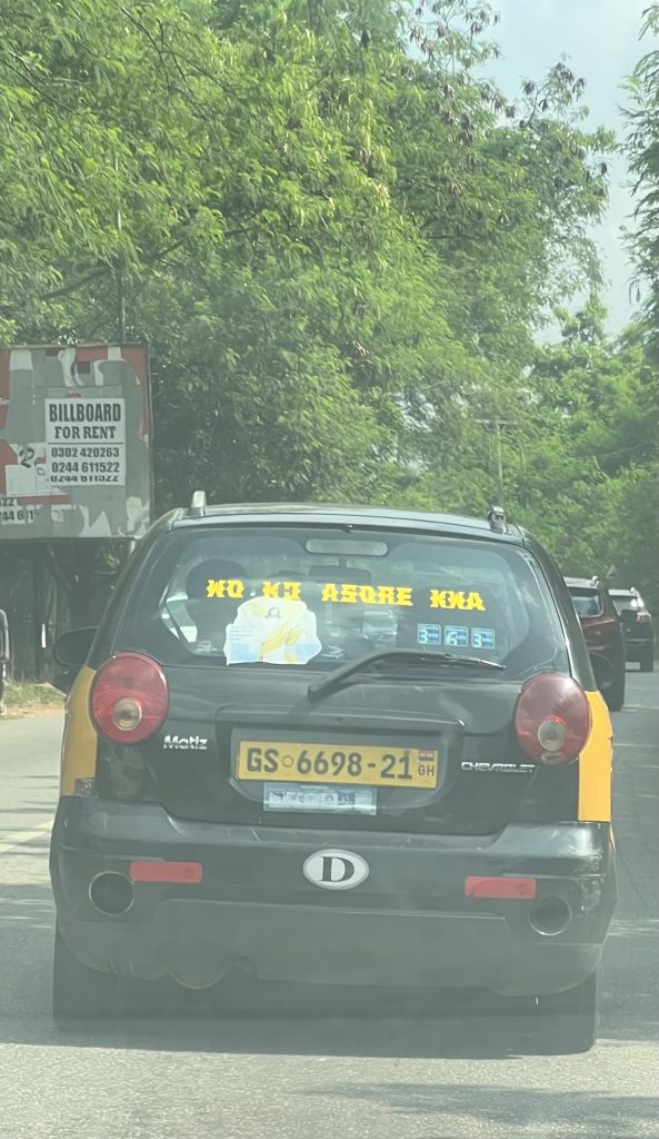
And then there’s the one that reads like a dare. WO KƆ ASƆRE KWA (your going to church is wasteful) sits above a small taped-up image of Jesus draped in gold cloth, both crammed into the same back window of a Chevrolet Matiz. Sarcasm needs a target, and this one is aimed squarely outward, a taunt for every churchgoer on the road who prays without meaning it, devotion and accusation sharing one window without apologising for the contradiction.
There’s something close to tattooing in how this text gets chosen. Nobody picks a tattoo carelessly. The whole practice depends on deciding, out of everything a life could be reduced to, which single line or image gets to stand in for the rest of it, inked permanently because it mattered enough to survive the pain of putting it there. Transport text is chosen with something like that same seriousness, one phrase picked out of everything a driver could have painted, and decided, this is the one, this is what represents me. What it doesn’t have is the permanence.
A tattoo commits a body to a belief for life. Transport text only has to survive until the next respray, the next owner, the next mood, which makes it a stranger kind of commitment, entirely sincere and entirely temporary at once.
What is transport text doing that the licence plate and the route number can’t? The plate says what a vehicle is allowed to do. The text says what the person behind the wheel believes today, fears today, hopes today, or is daring someone to challenge today, worn like ink that was always going to fade, and repainted anyway, because for now, it’s still true.
This is Textual Claims: typography used to investigate public life. The illustration below is my interpretation of the word TRANSPORT, using depth and dimension so the text itself becomes the image.
