A man once ran for the highest office in the country without showing his face anywhere in his own campaign. Decades earlier, a woman’s entire campaign fit onto a clipping the size of a postcard. Between those two withholdings sits everything election typography has had to decide about how much a name is owed before anyone has cast a vote.
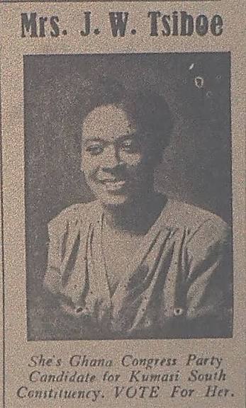
The postcard belongs to Mrs. J.W. Tsiboe, a 1960 newspaper clipping carrying a photograph, a name, a party affiliation, and three words of instruction: VOTE For Her. That is the entire persuasive apparatus this particular clipping shows, a face small enough to be mistaken for anyone, a name printed once, a command with no argument behind it. The text does not explain what she believes or what she has done. It only asks to be remembered long enough to be marked on a ballot weeks later. Everything that has happened to Ghanaian election typography since is an argument about how much more than that a name needs to do.

Move a candidate from a constituency to a country and the typography answers immediately. A poster for John Mahama as MP for Bole/Bamboi sits his name below his photograph in a size no larger than the party’s own umbrella symbol, boxed inside a red card that looks assembled rather than designed. VOTE sits in a starburst like a price tag. The constituency’s name takes up nearly as much space as his own.

Decades later, campaigning for president, his surname alone is stacked vertically down the right edge of a red field in letters taller than his own head, no first name required, no office named until the smaller type underneath. PRESIDENT no longer sits beside his name. It sits inside it, the way a title becomes part of how a name is said. A constituency needs to know this candidate is here and where to find them. A country asks to be able to see the name from a moving car.
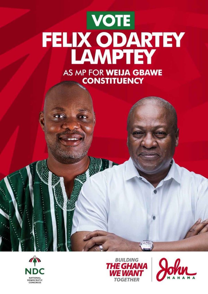
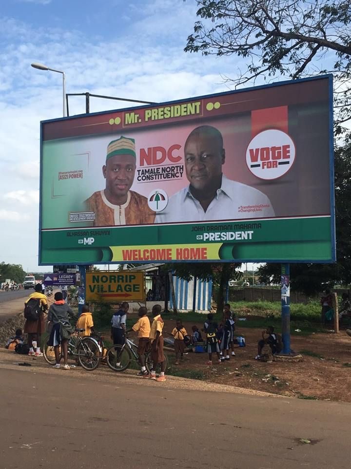
That scaling runs in the other direction too, and the material makes the direction visible. On a poster for a parliamentary candidate in Weija Gbawe, his portrait sits beside Mahama’s, both men’s arms crossed in the same confident pose, the presidential candidate’s photograph occupying more of the page than the man actually running in that constituency. A billboard for an MP hopeful in Tamale North repeats the arrangement: local candidate on the left, “Mr. President” welcomed home on the right, in letters large enough to be read by a bus. Neither poster is really asking a constituency to evaluate its own candidate. Each is asking the constituency to transfer trust already established in a bigger name onto a smaller one standing next to it. The local candidate does not grow into scale, he borrows it, and the typography is honest about the borrowing: his name is never given more visual weight than the name he is borrowing from.
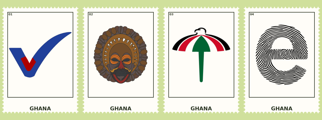
The party’s part in this is more disciplined than any single candidate’s. A photograph, a party symbol, a fingerprint, arranged left to right or stacked top to bottom, repeats at every level of the ballot, presidential candidate, parliamentary candidate, and an electoral-area secretary running for a seat most voters outside his own area will never hear named again. The three elements do not change. Only the face in the first box does. What this format gives a candidate is legibility he has not yet earned, a voter who has never seen his name before still knows exactly where to look and what shape the choice will take at the booth. What it takes from him is harder to notice, because the same design that makes him instantly readable also makes him instantly interchangeable with every other candidate wearing his party’s colours. The individual is legible, the individual is also, by the same stroke, optional.
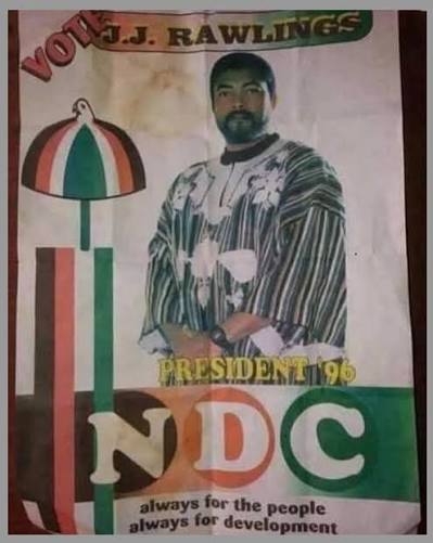
The objects carrying this text have changed shape as much as the text itself. J.J. Rawlings’ 1996 campaign appears on a signboard built as a box, the same face printed twice and mounted at right angles so a driver approaches from either direction and meets an identical portrait before rounding the corner. It is not a billboard in the sense audiences know today, no single flat sheet visible from one primary approach, but a small hinged structure solving a specific problem: a junction with traffic converging from two directions, and one board doing what might elsewhere have taken two. Few people today would recognise the format on sight. The flat, single-face vinyl billboard eventually became the standard, and a digital display now solves the same two-direction problem by looping content rather than physically doubling the printed face. The Rawlings box did with carpentry what a screen now does with software.
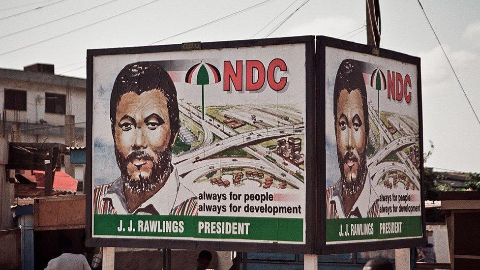
Across three and a half decades the party’s discipline shows up as a phrase rather than a box. Rawlings’ 1996 material and a party mural painted directly onto a building both carry some version of “always for the people, always for development,” the line surviving changes in candidate, decade, and even medium, painted wall or printed poster, apparently indifferent to which. A party’s slogan is not written new each time it is needed, it is retrieved.
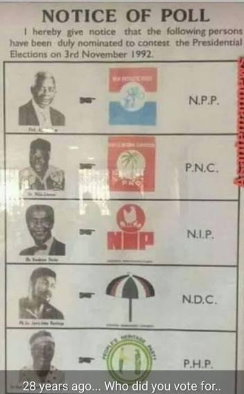
Beside all of this campaign material sits a different kind of document entirely: an Electoral Commission Notice of Poll from 1992, five candidates named by the state itself, photograph, symbol, and party set out with no persuasion attempted anywhere on the page. Unlike every poster and billboard before it, it is not trying to make anyone vote for anyone. It exists only so that a name and a symbol will match, correctly, inside a booth. Every other poster is a rehearsal for that single unpersuasive document.
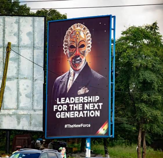
Then a campaign arrives that refuses the entire convention at once. A billboard shows a carved mask over a suit, no name attached, no party symbol, no fingerprint, just THE NEW FORCE. EMBRACE THE CHANGE. Weeks pass. The mask appears again across several similarly suited figures in one frame, and on a woman declaring I BELONG TO THE NEW GENERATION. I AM THE NEW FORCE, an image built to look like a movement was gathering behind whoever this was. In practice the campaign belonged to one man already known publicly, as a businessman, under other names, (Freedom, Cheddar) long before Nana Kwame Bediako ever appeared on a billboard. The man behind the mask wasn’t a stranger to the public exactly. What the mask concealed was not a face nobody had seen, but news nobody had expected: that an already-famous businessman was now running for president. The surprise the reveal delivered was less whose face this turned out to be than the fact that this particular face now belonged to a ballot.

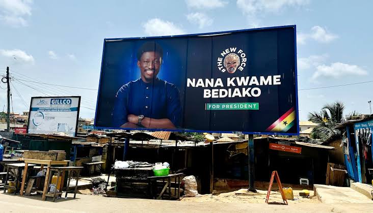
Once shown, the mask does not disappear from the ballot graphic. It takes the exact place where a party’s umbrella or elephant would normally sit, the same three-box format every other candidate uses, photograph, symbol, fingerprint, except the symbol here is the very thing that once stood in the slot where his name would otherwise have gone.

Even before the reveal, the language on these billboards was doing more work than any other text considered so far. THE NEW FORCE. EMBRACE THE CHANGE. I BELONG TO THE NEW GENERATION. I AM THE NEW FORCE. LEADERSHIP FOR THE NEXT GENERATION. Full declarative sentences, stacked one after another across separate boards over separate weeks, building an argument in instalments rather than delivering it once. No other campaign here talks this much. A party’s typical vocabulary runs to a name, a symbol, a slogan short enough to fit under a photograph, VOTE, at most a sentence retrieved wholesale from an earlier decade and left alone. This campaign wrote and rewrote itself in full sentences, in the register of a product launch rather than a political one, the kind of copy a spirits brand might run across a city for a limited release, a mask standing in for a bottle not yet unveiled. A conventional Ghanaian campaign would have let a candidate explain himself in an interview, a platform speech, a manifesto launch attended by cameras, the text on the poster only ever pointing toward where the real explaining happens. This one explained itself almost entirely on steel poles, in weeks of sentences doing the work television usually does, the copy so heavily loaded with meaning-making that by the time the face appeared it was already the least surprising thing about the campaign.
That slot is where every example here keeps returning. A party writes its candidate’s name into a box already trained to be read fast, and the name inherits legibility it has not yet earned. The state writes every name into a form that persuades no one and asks only to be matched correctly at a booth. A slogan gets written once and retrieved for thirty years. A surname gets stacked taller than a head the moment ambition changes. Bediako’s campaign is the one exception that left the slot empty on purpose, for weeks, and found that a blank could hold a country’s attention as well as a name ever has.
A name entering public space to ask for power stops being only a name. It has to be given scale, or borrowed, or repeated, or withheld, before anyone will trust it to speak for itself.
This is Textual Claims: typography used to investigate public life. The illustration below is my interpretation of the word VOTE, using depth and dimension so the text itself becomes the image.