In 2015, a protester carried a refrigerator through the street with a message written across its door in red marker. Nine years later, at a protest over the exact same grievance, another protester carried a sign whose lettering looked nothing like that red marker, printed rather than handwritten, clean enough to have come right off a printer. Between those two objects sits a question about what a placard has to become before a crowd will agree to speak through it.
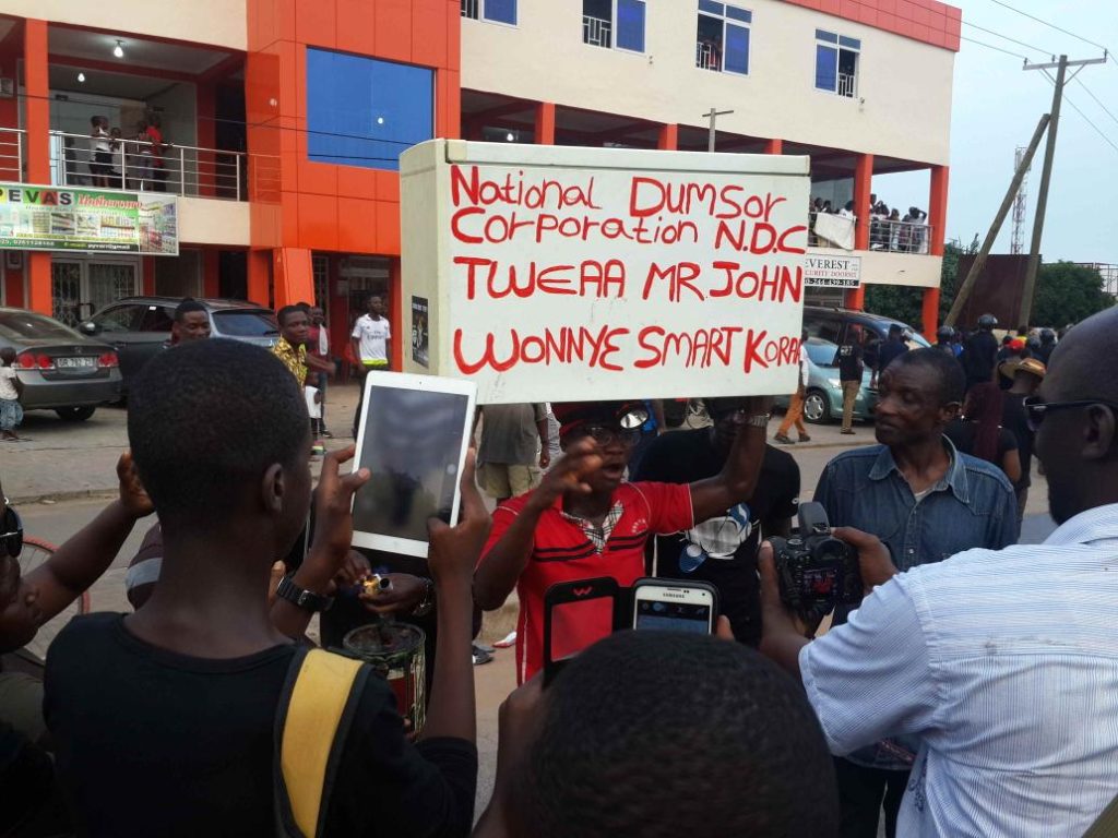

The refrigerator’s message was not really addressed to the people walking past it.
“National Dumsor Corporation N.D.C. Tweaa Mr. John Wonnyɛ smart koraa” renames the ruling party’s own acronym into an insult and folds a Twi expression of contempt into an English mock-corporate title, aimed past the crowd and directly at the president. A gas cylinder carried the same year addresses him even more plainly, “MR PRESIDENT DO SOMETHING ABOUT DUMSOR,” in handwriting on paper wrapped around the gas cylinder. Both objects existed before they became protest text and were still recognisably themselves underneath it, a fridge with red marker on its door, a gas cylinder with a message hanging from its neck. The text borrowed the object’s weight without erasing the object.
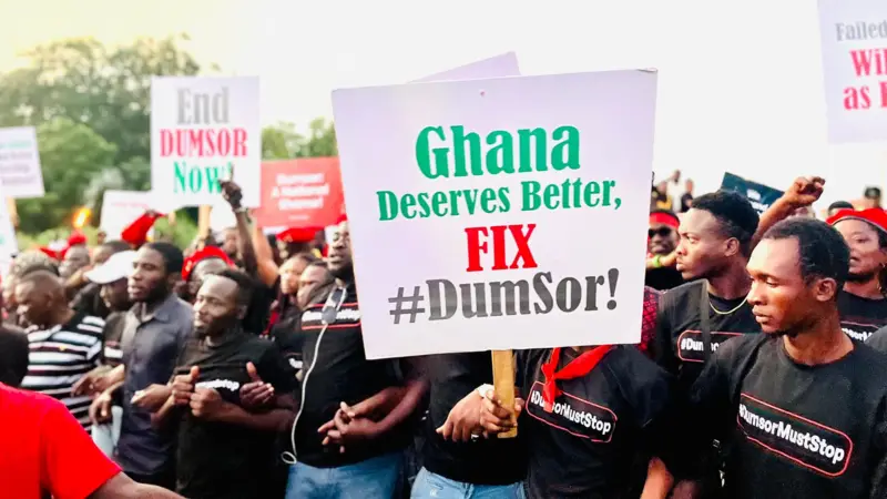
Nine years on, at a protest over the same power cuts, the government has changed entirely, Mahama’s NDC has given way to Akufo-Addo’s NPP, the objects are gone and the handwriting mostly is too. “Ghana Deserves Better, FIX #DumSor!” is printed, not handwritten, clean lettering with none of the improvisation a marker demands. In 2015 the hashtag was something written onto whatever object was at hand. By 2024 it is backing a single design, decided on before the march even started.
The address itself has changed shape along with the production too, “Turn On the Lights, Nana!” drops the presidential title the gas cylinder once offered a different president, and goes straight to Akufo-Addo’s own name, without the deference that title is meant to carry. The dropped title carries its own accusation. We were gracious the first time, it seems to say, and if the same light off is still here nine years and an entire government later, that grace was clearly wasted on you.

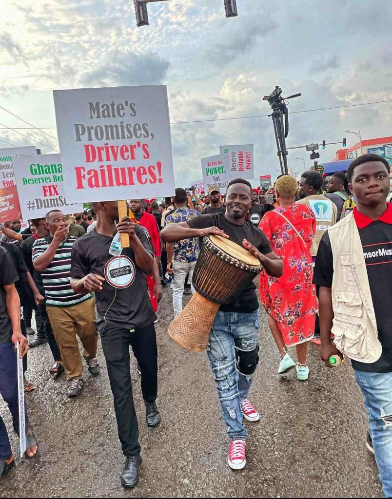
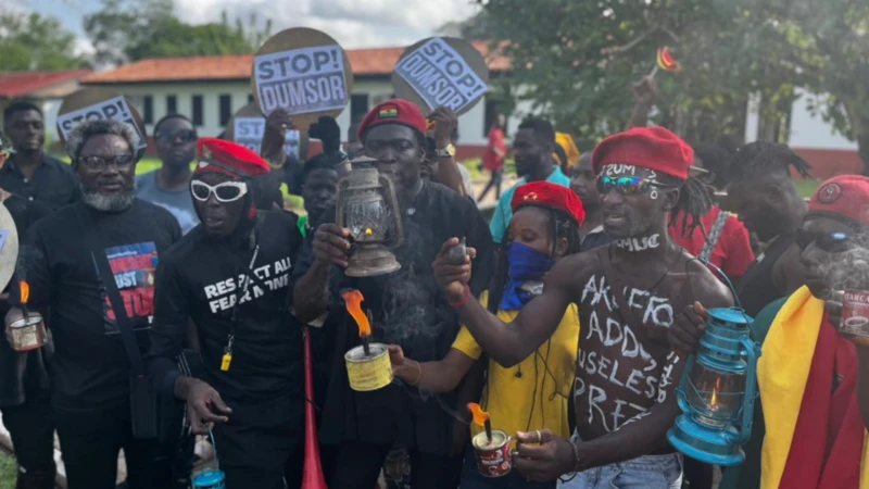
That informality doesn’t replace the older, more respectful register so much as sit beside it. At the same 2024 protest, a man carries a sign reading “Mate’s Promises, Driver’s Failures!”, borrowing a tro-tro’s own internal blame structure, the conductor who makes the promises and the driver left holding the consequences, to describe a government that has done the same to its citizens. Elsewhere someone holds “God Bring Back My Mum And Take Akufo Addo Away,” a real loss and a political demand traded against each other in the exact shape of a joke, grief doing comedy’s work rather than standing apart from it. And away from the printed placards entirely, a shirtless man has “AKUFO ADDO USELESS PRESIDENT” written directly onto his own skin in marker. Three different surfaces, printed cardboard, a joke, a body, all carrying the same protest at the same time.
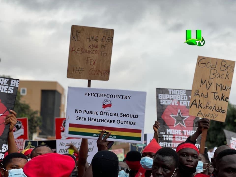
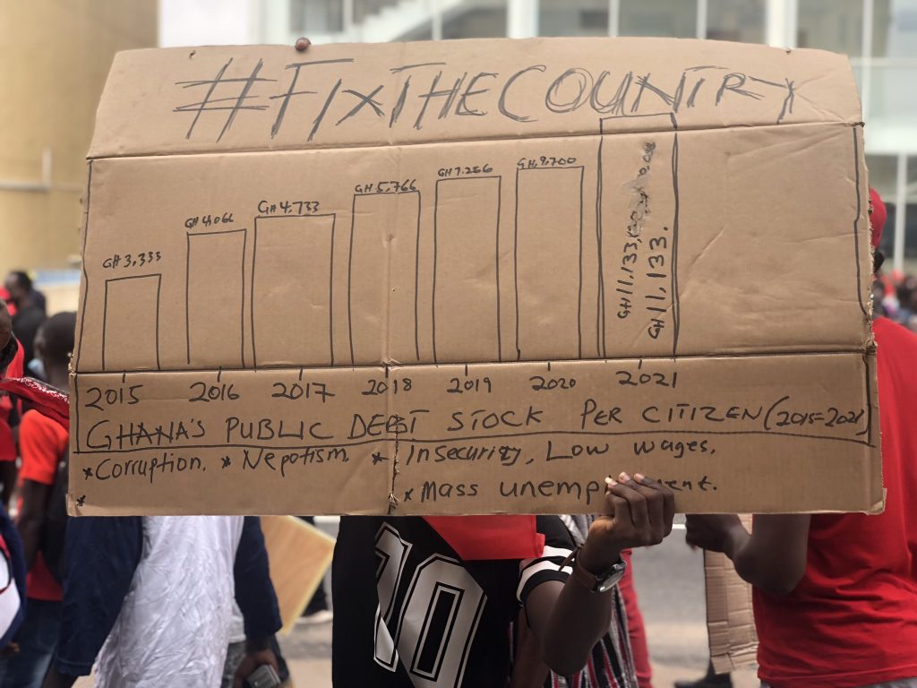
What happens next starts with one organisation’s own choice of design. Democracy Hub Ghana convenes a protest in 2021 and sets the words FIX THE COUNTRY in the same heavy, condensed type everywhere they appear, alongside a raised fist in a red banner. That lettering turns up on branded yellow t-shirts, a marching band’s uniforms, and placard after placard reading “Killer Rents,” “Bad Roads,” “Corruption,” “Youth Power!”, each card cut to the same size, same typeface, a design decided on before a single protester arrives. Beside all of that, one protester holds a message no printer touched, a hand-drawn bar chart on cardboard charting Ghana’s public debt stock per citizen from 2015 to 2021, with a bulleted list of causes underneath, corruption, nepotism, insecurity, low wages, mass unemployment. The chart argues with evidence. FIX THE COUNTRY, set the same way on every surface it touches, has stopped working as three words read in sequence and started working as a single shape, closer to a logotype than a sentence, which it can only do because an organisation decided in advance what that shape should look like. Once a viewer can recognise that lettering without reading it word by word, it has started doing something the fridge’s lettering never had to do. The fridge’s words were the whole argument, nothing stood between the marker and the reader. FIX THE COUNTRY now arrives as a shape first and a sentence second, which is already most of what #FixTheCountry had been doing days earlier, before the protest began. The hashtag’s own convention, three capitalised words fused into one unbroken string, was built for Twitter’s need to collect every scattered post under one searchable term, not for anything a printer would later cut into cardboard. Most of the people marching had already seen the hashtag online before they ever saw a placard, that is how a great many of them found out the protest was happening in the first place. The cardboard lettering is catching up to a shape that had already done its recognising work on a phone screen.

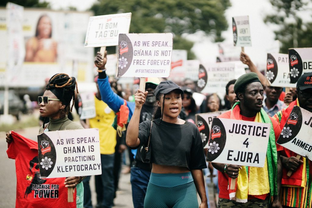
By 2023, convening a protest, the Democracy Hub GH brings the same red-and-black card with them, this time built around a line repeated at the start of several different, fully printed placards, closer to a chorus than a slogan. “As we speak…” opens card after card, “Ghana is not free forever,” “Ghana is practicing kleptocracy,” “is the language of a crook president.” The repetition of ‘as we speak’ is the organisers’ own device, the kind a hook does in a song, the same three words recurring down the row until a dozen separate, specific accusations start to read like verses of one chant rather than a dozen unrelated complaints. On the card itself, the shared opening and each specific ending sit in identical type, same weight, same size, same colour. On other cards at the same protest, two more first names appear, “Justice 4 Ejura,” “Justice 4 Ahmed,” joining a name from the earlier protests, the same card now doing memorial work as much as demand-making. Most of the people holding these cards could not name the organisation that designed them. They turned up for the grievance, not the group, and the lettering had already stopped needing anyone to know who made it.
In 2024, a fourth protest over illegal mining borrows the same red-and-black template, and by then that template has learned to hold almost anything. “This Is Not A Political Motive. It’s A State Emergency” defends the protest’s own legitimacy before making a single demand. “Abosom Don’t Have A Place To Stay In Our Water Bodies” argues the damage by invoking displaced gods and leaving the harsher point unsaid, if even the gods have nowhere left in the water, people clearly don’t either. A wearable sandwich board, three cardboard panels strung over a man’s own body, turns the placard into a garment, the body itself carrying the text everywhere it goes rather than a single raised arm. And “Wonitwaasedi, big time if you politicize Galamsey issue” sits inside the identical printed frame as every policy demand around it, an insult about your mother laid out in the same typeface, the same red border, the same hashtag, as “Clean Water Over 24-Hr Economy.” The lettering can’t tell the difference between an argument and an insult. It only knows how to make either one easier to see, so the insult borrows a visual authority the design never asked it to earn.


What protest typography has to do, whatever decade or object it is working with, is create the visual conditions under which separate acts of speech can begin to read as one voice. In 2015 it did that by being set directly onto an object with its own history, red marker inheriting a fridge’s domestic weight the moment it was written there instead of on a blank card. By 2021 it did it by collapsing a sentence into a shape, FIX THE COUNTRY set the same way often enough that it stopped being three words read in order and started being recognised whole, the way a logotype is. By 2023 it did it by repeating only an opening line and setting everything after it in identical type regardless of who supplied the ending, so an accusation decided on the spot carried the same visual authority as one planned months in advance. And by 2024 it was doing both at once, through a sign that had stopped being made in the moment, printed in advance rather than written by hand, existing as a finished design before anyone picked it up, and through a shared template’s simple indifference to what it was asked to carry. It does not discriminate between the legitimacy of a demand and the vulgarity of an insult; it simply gives both the same typographic treatment. That is the one thing protest lettering reliably does: treat whatever sits inside it as equally worth reading.
None of these are the same device, and none of them needed to be. Whatever gets invented next to do this job, a sticker, a filter, a font nobody has designed yet, will be tested the same way these five protests already test it, not by whether the words are true, but by whether the lettering can make separate people read as one voice.
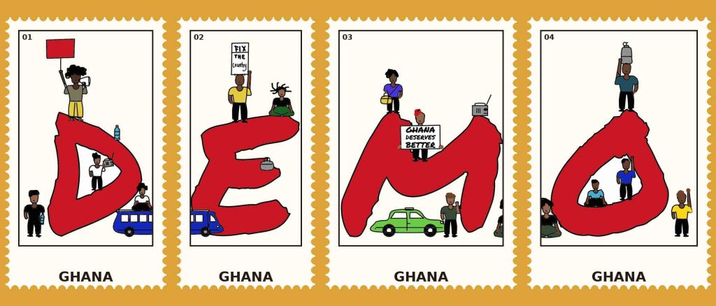
This is Textual Claims: typography used to investigate public life. The illustration below is my interpretation of the word DEMO, using depth and dimension so the text itself becomes the image.