
A Ghanaian obituary poster is recognisable before it is read. A large portrait, a smaller second photograph in a frame or medallion, an age set inside a shield or circle, a header phrase in script, a line at the bottom inviting “all friends and sympathizers.” That combination announces the genre before any name registers, which means some of the poster’s work is already done before the typography reaches the specifics of any one life. What those specifics turn out to make public is not the same thing in every case, and the difference is the real subject here.
For some lives, what gets made public is standing. A poster of a man of seventy-five, states his grandchildren as forty-six and his great-grandchildren as forty-two, each count on its own line, printed with the same precision as a date. Another, for a woman of ninety-five, goes further, a hundred and fifty grandchildren, sixty great-grandchildren, nephews and nieces named across towns and countries on three continents. A photograph could show a face. It couldn’t produce a geography of descendants that wide. The typography is doing a kind of accounting that nothing else on the page could do, and what it’s making public isn’t the death at all, it’s the reach a life had managed to accumulate by the time death arrived.


For other lives, what gets made public is almost entirely the fact of loss itself, with no accounting attached. A poster for someone in their late teens gives a name, an age, two dates, a wake location. No chief mourners, no siblings, no lineage. The poster gives us little beyond the fact of the death, and no wider network of names or relationships is recorded on it. Another, for a teenager a little younger, carries an unusually full mourner list for someone that age, split formally into father’s side and mother’s side, his occupation printed beneath his name before anything else is said about him. The split itself makes something public without stating it: one side’s list is made up of tradesmen and family elders, the other’s includes a former Inspector-General of Police, a former ambassador, a sitting Council of State member. Nothing on the poster says what that difference means. The layout makes it visible anyway, simply by recording who stands on each side.


Faith is what the lettering reaches for when neither of those is quite enough. Obituaries for older people are dated not with a born-and-died line but “Sunrise” and “Sunset,” a life measured as a single day’s arc rather than a span of years, which is a theological claim before it’s a biographical one, it says the death is a setting, not an ending. The vocabulary across the posters splits the same way by age. The old get “Called To Glory,” “Home Call,” “Transition,” language that treats death as arrival. The young get “Painful,” “Shock,” “Gone Too Soon,” language built around how little warning there was. Neither vocabulary is announcing the death more or less than the other. They’re making public two different relationships to the fact of dying, one that had time to be prepared for, one that didn’t.

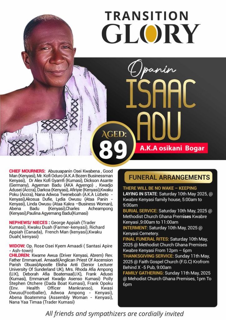
Identity gets made public too, but through a device that runs almost independent of age or standing: the second name. One man’s large, ornate name carries an “A.K.A.” beneath it in small plain caps, the name his community actually used. Another becomes, in the same small type, a nickname built from an old nickname. A third is remembered on his poster mainly by a trade name people called him by at work. Two names sit on the same page in two different registers, one assembled from lineage and ceremony, one assembled from whatever people actually called the person while they were alive, and the lettering keeps both but never at equal weight. The formal name gets the ornament. The name people used gets the footnote. What’s being made public there isn’t standing or faith at all, it’s the gap between how a family wants a person remembered and how that person was actually known.The typography doesn’t make the same thing public across every poster. Each one selects what to make visible about the life it commemorates: descendants where a family chose to count them, a theological claim where faith offered one, a second name kept alongside the formal one, and, on some posters, little beyond the fact of the death and how sudden it was. But look at the whole set together and a second thing becomes visible, which no single poster states outright. The choices repeat. The same shield for an age, the same invitation to sympathizers, the same instinct to count, to date by faith, to keep a second name alive beside the first. A family does not invent how to announce a death. It reaches for an inherited public form the community already recognises, and in reaching for it, tells you as much about what that community values as it tells you about the person being mourned. The poster is never only about who died. It is also a mirror the living didn’t ask for, showing them what they think a life is required to have before it can be properly let go
This is Textual Claims: typography used to investigate public life. The illustration below is my interpretation of the word FUNERAL, using depth and dimension so the text itself becomes the image.
