
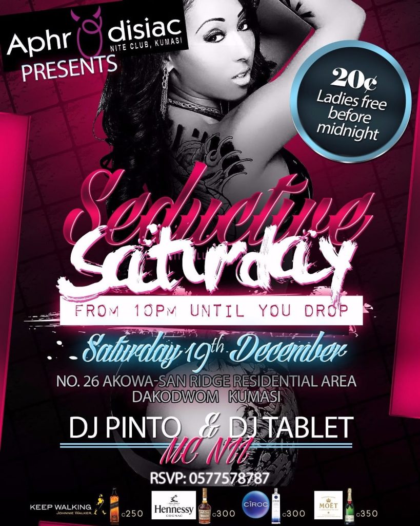
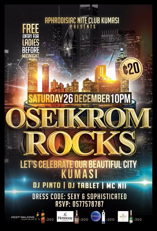
What makes one night different from the next when the DJs, the MC, the price and the phone number never change? At Aphrodisiac, a popular nightclub that closed years ago, the answer was the lettering. Pink script with white brush strokes dragged through it, and a promise to keep going “until you drop.” Gold script floating over thick white capitals, the whole page washed white, gold capitals over a skyline of lit towers. Three nights in December, with the same details printed underneath each.
The lettering was the venue’s strategy. Aphrodisiac built events to repeat, and the reliability was the draw. On top of it the club curated occasions, nights with a name and a reason to come that an ordinary week did not have. The All White Affair was billed as the club’s fourth annual all white party, and it was dressed in white from the first letter to the last. One club, one set of regulars, and a different pull each time to get them through the same door, with the lettering doing the persuading.

Other venues followed the same logic. Front/Back hosts Amapiano & Brunch, a name that pairs a genre with a meal, set in fat red retro capitals with a black extruded shadow, and the venue’s own name sits beneath it in thin, spaced capitals. The event gets the heavy letters because the event is what has to be sold. The venue is already known, so its name can sit small beneath it.

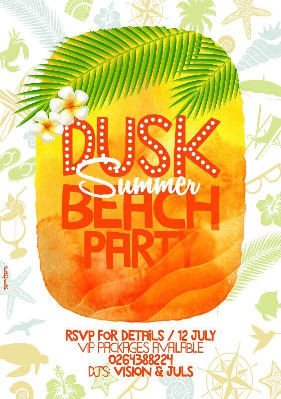
Then there are parties that belong to nobody’s building. A group of organisers comes together, makes an event, and takes it to whichever club or bar will host it. Dusk is the example most millennials would reach for: it is known as a party, not as a place. When the room changes, the name and the way it is drawn are all that travel, so that is where the work gets done. On a beach in July, Dusk is red-orange letters studded with white dots like the bulbs of a marquee, over a watercolour sunset. At a hip-hop night in December, it is cold white capitals cut with hairline etching, over a dark web of purple lines. A venue can lean on its walls. An organiser has a name and a face for it. The wording of the billing shifts to match: “Akwaaba UK presents” Softlife, with the venue set below as a labelled field in spaced capitals, and “Eazy D Sound System presents” Gbushke, “@ Edan.” The organiser’s name leads, and the room becomes information.

Types of party spread the same way: Day parties became a thing. Bloom Bar hosts them, and so do venues and individual organisers across the city, and the phrase has become generic enough that each one has to be dressed to mean anything. Bloom Bar sets Day Party in tall navy capitals, the letters stepping up and down in size over a gradient of bubbles and palm shadows, and for Independence Day sets it again in heavy yellow across a green page. Vici goes furthest and makes the format its name: Vici Day Party, with the last two words set small and bent around the foot of a round white sign held up by a hand.


Food holds its own parties. Waakye was the most popular, and jollof and kenkey have each grown a party or festival of their own over the years. Here the lettering has to carry appetite and scale at once. One waakye party announces itself in a scatter of colours, each line in a different typeface, a purple box, a pink line, a brown one, ending “Don’t be Told…..!!!” In 2013 an Airtel-backed one sets its title in swollen red italic capitals under quotation marks. By 2019 the dish has become “The Waakye Summit,” with a line beneath it reading “The Biggest Waakye Festival,” and the Year of Return is named in a single line of script beneath it, “Year Of Return Edition.” It sits where a subtitle sits, smaller than the name, so the dish stays in front and the year frames the summit as that December’s edition. The plate of food is much the same. The nouns around it have grown from party to summit to festival.

How you get in has changed, and the smallest type shows it first. In 2013 a waakye party gives a BlackBerry PIN for enquiries. Clubs and beach parties give a number to ring, and a day party gives a number or a web address for reservations. By 2019 Detty Rave hands the bottom quarter of its page to ticket buying: a banner reading GET YOUR TICKETS NOW above four panels, an app, a short code to dial, online banking, a branch. Softlife, in December 2025, prints two web addresses and a highlighted line of table-booking numbers. The path is not a straight line, since a 2019 waakye summit still ends on a phone number for more information. But the instruction has grown from a way to ask into a way to pay, and the newest party shrinks it again to a single line in the corner: “Tickets Available Now!”

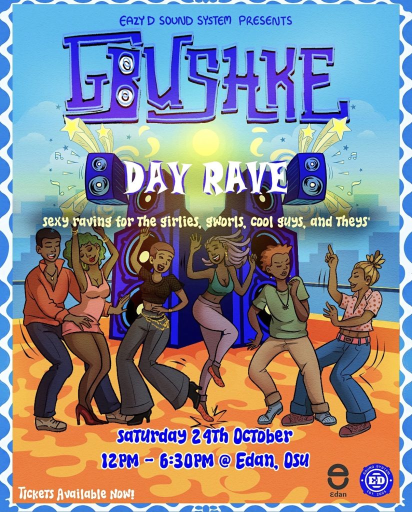
The word itself is shifting. Some events that might once have been called parties now call themselves raves. Detty Rave was early, in 2019, in dry black brush lettering with ribbons of red, yellow and green running through it. Now a daytime event running from noon to half past six calls itself a Day Rave. That most current example (set for 24th October 2026) takes its name from a sound. Gbushke is the sound a dancing beat makes as Ghanaians say it, and the lettering gives that sound a body: tall, blocky purple letters edged in light blue, with speaker cones set into the first of them, above illustrated stacks of speakers. Beneath it come the words Day Rave in white with a blue shadow, and in soft, wobbling lowercase a line addressed to “girlies, gworls, cool guys, and theys.” The line opens with “sexy raving,” which makes the word a verb: where “party” names an occasion, “rave” names what you will be doing there. Earlier nights set a dress code in capitals and told you what to wear. This one names who is welcome, in loose, rounded lowercase that reads as an invitation.
So what is a party asking the public to recognise? For a venue, a house that dresses differently every night. For an organiser without a house, a name that must be recognised in whatever room it lands in. For a party named after a sound, something that cannot be printed at all: the vibe of the night itself. The date and the venue say where to stand. The lettering says who you will be there and, in a name like Gbushke, how it will feel when you arrive.
This is Textual Claims: typography used to investigate public life. The illustration below is my interpretation of the word PARTY, using depth and dimension so the text itself becomes the image.
